)
提交工单
咨询集成、功能及报价等问题
The message component of the In-app Chat Kit provides the message list and message transmission features.
)
Integrate the In-app Chat Kit SDK into your project (finished the initialization and login are required). For more information, see Quick start.
In the file that needs to use the MessageList component, use the ZIMKitMessageListPage widget.
(The ZIMKitMessageListPage widget consists of the appBar, ZIMKitMessageListView component, and the ZIMKitMessageInput component.)
import 'package:zego_zimkit/zego_zimkit.dart';

class YourMessagePage extends StatelessWidget {
  const YourMessagePage({Key? key, required this.conversationID, required this.conversationType})
      : super(key: key);

  final String conversationID;
  final ZIMConversationType conversationType;

  @override
  Widget build(BuildContext context) {
    return ZIMKitMessageListPage(
      conversationID: conversationID,
      conversationType: conversationType,
    );
  }
}If the default message-relevant features, behaviors or UI don’t fully meet your needs, we allow you to flexibly customize those through the parameters provided by the ZIMKitMessageListView and ZIMKitMessageInput mentioned in this section.
ZIMKitMessageListPagehas all the parameters ofZIMKitMessageListViewandZIMKitMessageInput, so you can pass any parameters toZIMKitMessageListViewandZIMKitMessageInputthroughZIMKitMessageListPage.
The usage of commonly used parameters is as follows:
The UI of each message can be customized, You can use the messageItemBuilder or messageContentBuilder to build your custom message widget.
messageContentBuilder:
In most cases, you may only need to customize the message body, while keeping the avatar or the send status icon next to the message. to do so, you can use the messageContentBuilder. The parameter types are as follows:
final Widget Function(BuildContext context, ZIMKitMessage message, Widget defaultWidget)? messageContentBuilder;You can use it like this.
ZIMKitMessageListPage(
  conversationID: conversation.id,
  conversationType: conversation.type,

  messageContentBuilder: (context, message, defaultWidget) {
    if (message.type == ZIMMessageType.custom) {
      return RedEnvelopeMessage(message: message);
    } else {
      return defaultWidget;
    }
  },
);
messageItemBuilder:
ZIMKitMessageListView is essentially a listView. If you need to customize the drawing of the avatar, message body, sender's name, and sending status, you can use the messageItemBuilder."
The parameter types are as follows:
final Widget Function(BuildContext context, ZIMKitMessage message, Widget defaultWidget)? messageItemBuilder;In addition to fully customizing the message item, you can also change the primaryColor of the default message widget to yellow. The code is as follows:
ZIMKitMessageListPage(
  conversationID: conversation.id,
  conversationType: conversation.type,

  messageItemBuilder: (context, message, defaultWidget) {
    return Theme(
      data: ThemeData(primaryColor: Colors.yellow),
      child: defaultWidget,
    );
  },
);To customize the press and long press events for a message, use the onMessageItemPressed and onMessageItemLongPress. The parameter types are as follows:
final void Function(BuildContext context, ZIMKitMessage message, Function defaultAction)? onMessageItemPressed;
final void Function(BuildContext context, LongPressStartDetails details, ZIMKitMessage message, Function defaultAction)? onMessageItemLongPress;
For example, you can implement functions such as a full-screen preview of images and file download by customizing click and long-press events like this:
ZIMKitMessageListPage(
  conversationID: conversation.id,
  conversationType: conversation.type,

  onMessageItemLongPress: (context, details, message, defaultAction) {
    debugPrint('onMessageItemLongPress: ${message.hashCode}');
    defaultAction();
  },
  onMessageItemPressed: (context, message, defaultAction) {
    debugPrint('onMessageItemPressed: ${message.hashCode}');
    defaultAction();
  },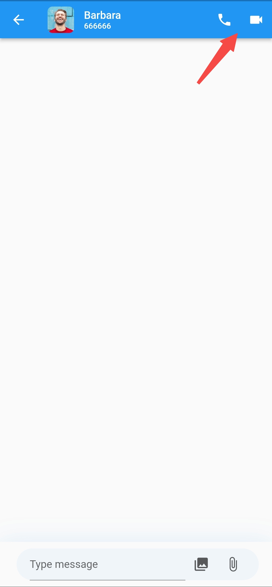
);To customize the app bar, you can use appBarActions or appBarBuilder. The parameter types are as follows:
final List<Widget>? appBarActions;
final AppBar? Function(BuildContext context, AppBar defaultAppBar)? appBarBuilder;
For example, adding a call button to the app bar, and the preview effect is as follows:
)
Here are two ways to achieve this:
appBarActions parameter. The sample code is as follows:ZIMKitMessageListPage(
conversationID: conversation.id,
conversationType: conversation.type,
appBarActions: [
IconButton(icon: const Icon(Icons.local_phone), onPressed: () {}),
IconButton(icon: const Icon(Icons.videocam), onPressed: () {}),
],
);appBarBuilder parameter. The sample code is as follows:ZIMKitMessageListPage(
conversationID: conversation.id,
conversationType: conversation.type,
appBarBuilder: (context, defaultAppBar) {
return AppBar(
title: Row(
children: [
CircleAvatar(child: conversation.icon),
const SizedBox(width: 15),
Column(
crossAxisAlignment: CrossAxisAlignment.start,
children: [
Text(conversation.name, style: const TextStyle(fontSize: 16), overflow: TextOverflow.clip),
Text(conversation.id, style: const TextStyle(fontSize: 12), overflow: TextOverflow.clip)
],
)
],
),
actions: [
IconButton(icon: const Icon(Icons.local_phone), onPressed: () {}),
IconButton(icon: const Icon(Icons.videocam), onPressed: () {}),
],
);
},
);appBarBuilder. ZIMKitMessageListPage(
conversationID: conversation.id,
conversationType: conversation.type,
appBarBuilder: (context, defaultAppBar) {
return null;
},
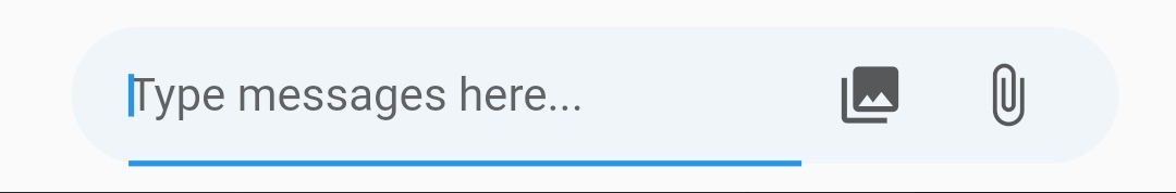
);The input field uses the TextField component in Flutter.
TextField, pass the InputDecoration parameter to the component through the MessageListPage.
The following shows the sample code and effect:ZIMKitMessageListPage(
conversationID: conversation.id,
conversationType: conversation.type,
inputDecoration: const InputDecoration(hintText: 'Type message here...'),
);)
| Config | Default value |
|---|---|
| messageInputKeyboardType | TextInputType.multiline |
| messageInputMaxLines | 3 |
| messageInputMinLines | 1 |
| messageInputTextInputAction | TextInputAction.newline |
| messageInputTextCapitalization | TextCapitalization.sentences |
TextField is wrapped by a container, and you can also configure the container additionally. Here are the supported configurations and their default values.messageInputContainerPadding, The default value isconst EdgeInsets.symmetric(horizontal: 20, vertical: 10)
messageInputContainerDecoration, The default value is:
BoxDecoration(
  color: Theme.of(context).scaffoldBackgroundColor,
  boxShadow: [
    BoxShadow(
      offset: const Offset(0, 4),
      blurRadius: 32,
      color: Theme.of(context).primaryColor.withOpacity(0.15),
    ),
  ],
)You can customize the input background style using inputBackgroundDecoration.
The following shows the sample code:
ZIMKitMessageListPage(
  conversationID: conversation.id,
  conversationType: conversation.type,
  inputBackgroundDecoration: BoxDecoration(borderRadius: BorderRadius.circular(40)),
);showPickFileButton: whether to show the PickFileButton, which is shown by default. showPickMediaButton: whether to show the PickMediaButton, which is shown by default.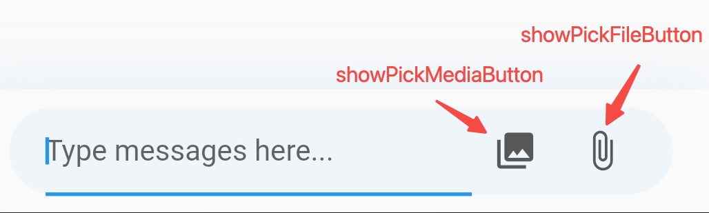)
Sample code:
ZIMKitMessageListPage(
  conversationID: conversation.id,
  conversationType: conversation.type,
  showPickFileButton: false,
  showPickMediaButton: true,
);sendButtonWidget: customize the style of the send button.pickMediaButtonWidget: customize the style of the media pick button.pickFileButtonWidget: customize the style of the file pick button.Sample code:
ZIMKitMessageListPage(
  conversationID: conversation.id,
  conversationType: conversation.type,
  showPickFileButton: true,
  showPickMediaButton: true,
  sendButtonWidget: const Icon(Icons.send),
  pickMediaButtonWidget: const Icon(Icons.photo_library),
  pickFileButtonWidget: const Icon(Icons.attach_file),
);messageInputActions.
For example, to add a microphone button and an emoji button on the left side of the input field, use the following sample code:ZIMKitMessageListPage(
conversationID: conversation.id,
conversationType: conversation.type,
messageInputActions: [
ZIMKitMessageInputAction.left(
IconButton(icon: const Icon(Icons.mic), onPressed: () {}),
),
ZIMKitMessageInputAction.leftInside(
IconButton(icon: const Icon(Icons.sentiment_satisfied_alt_outlined), onPressed: () {}),
),
],
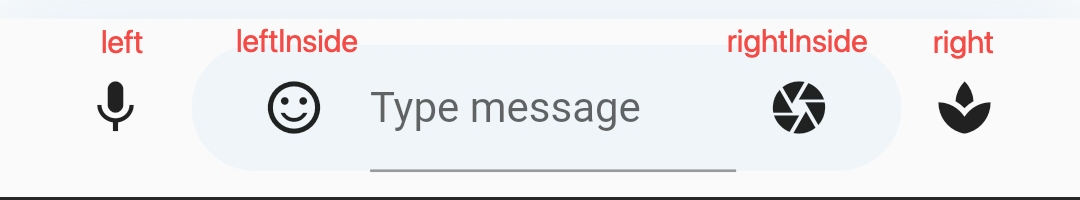
);As shown in the sample code, you can specify the position of the custom button relative to the
TextFieldby usingZIMKitMessageInputAction.left,ZIMKitMessageInputAction.right,ZIMKitMessageInputAction.leftInside, andZIMKitMessageInputAction.rightInside. Its position is as follows:
You can customize the message list background using inputBackgroundDecoration.
The following shows the sample code:
ZIMKitMessageListPage(
  conversationID: conversation.id,
  conversationType: conversation.type,
  messageListBackgroundBuilder: (context, defaultWidget) {
    return YourCustomBackgroundWidget();
  },
);messageListErrorBuilder: this can be used to customize the UI when error loading the message list.
messageListLoadingBuilder: this can be used to customize the UI when loading the message list.
preMessageSending: callback for the message not sent yet.
The following methods can be called using ZIMKit() syntax, such as ZIMKit().deleteMessage().
deleteMessage: Only delete local messages, after deletion, you cannot see the message yourself.recallMessage: Recall messages, can recall your own messages, or in a group chat, the group owner can recall messages from other members, after recall, users in the conversation cannot see the message anymore.By default, In-app Chat Kit supports recalling messages sent in 2 minutes. If you want to modify the default configuration (It can be configured to recall messages within 24 hours.), contact ZEGOCLOUD technical support.
Refer to the example code in _onMessageItemLongPress:
class ZIMKitDemoHomePage extends StatelessWidget {
  const ZIMKitDemoHomePage({Key? key}) : super(key: key);

  @override
  Widget build(BuildContext context) {
    return WillPopScope(
      onWillPop: () async => false,
      child: Scaffold(
        appBar: AppBar(
          title: const Text('Conversations'),
          actions: const [HomePagePopupMenuButton()],
        ),
        body: ZIMKitConversationListView(
          onPressed: (context, conversation, defaultAction) {
            Navigator.push(context, MaterialPageRoute(
              builder: (context) {
                return ZIMKitMessageListPage(
                  conversationID: conversation.id,
                  conversationType: conversation.type,
                  onMessageItemLongPress: _onMessageItemLongPress,
                );
              },
            ));
          },
        ),
      ),
    );
  }

  Future<void> _onMessageItemLongPress(
    BuildContext context,
    LongPressStartDetails details,
    ZIMKitMessage message,
    Function defaultAction,
  ) async {
    showCupertinoDialog(
      context: context,
      barrierDismissible: true,
      builder: (context) {
        return CupertinoAlertDialog(
          title: const Text('Confirme'),
          content: const Text('Delete or recall this message?'),
          actions: [
            CupertinoDialogAction(
              onPressed: Navigator.of(context).pop,
              child: const Text('Cancel'),
            ),
            CupertinoDialogAction(
              onPressed: () {
                ZIMKit().deleteMessage([message]);
                Navigator.pop(context);
              },
              child: const Text('Delete'),
            ),
            CupertinoDialogAction(
              onPressed: () {
                ZIMKit().recallMessage(message).catchError((error) {
                  ScaffoldMessenger.of(context).showSnackBar(
                    SnackBar(content: Text(error.toString())),
                  );
                });
                Navigator.pop(context);
              },
              child: const Text('Recall'),
            ),
          ],
        );
      },
    );
  }
}
The default effect when a message is recalled:
)
To hide the prompt for a recalled message ("Recalled a message" in the above image) or to customize the prompt style for recalling messages, you can use messageItemBuilder for customization.
Here is an example code snippet to hide the display of recalled messages:
class ZIMKitDemoHomePage extends StatelessWidget {
  const ZIMKitDemoHomePage({Key? key}) : super(key: key);

  @override
  Widget build(BuildContext context) {
    return WillPopScope(
      onWillPop: () async => false,
      child: Scaffold(
        appBar: AppBar(
          title: const Text('Conversations'),
          actions: const [HomePagePopupMenuButton()],
        ),
        body: ZIMKitConversationListView(
          onPressed: (context, conversation, defaultAction) {
            Navigator.push(context, MaterialPageRoute(
              builder: (context) {
                return ZIMKitMessageListPage(
                  conversationID: conversation.id,
                  conversationType: conversation.type,
                  messageItemBuilder: (context, message, defaultWidget) {
                    // *****  hide the display of recalled messages
                    if (message.type == ZIMMessageType.revoke) {
                      return const SizedBox.shrink();
                    } else {
                      return defaultWidget;
                    }
                  },
                );
              },
            ));
          },
        ),
      ),
    );
  }
}You can use ZIMKit().deleteAllMessage() to delete all messages in this conversation.
If you only want to delete the message on this device, you can set isAlsoDeleteFromServer to false.
ZIMKit().deleteAllMessage(
  conversationID: conversationID,
  conversationType: conversationType,
  isAlsoDeleteFromServer: true,
);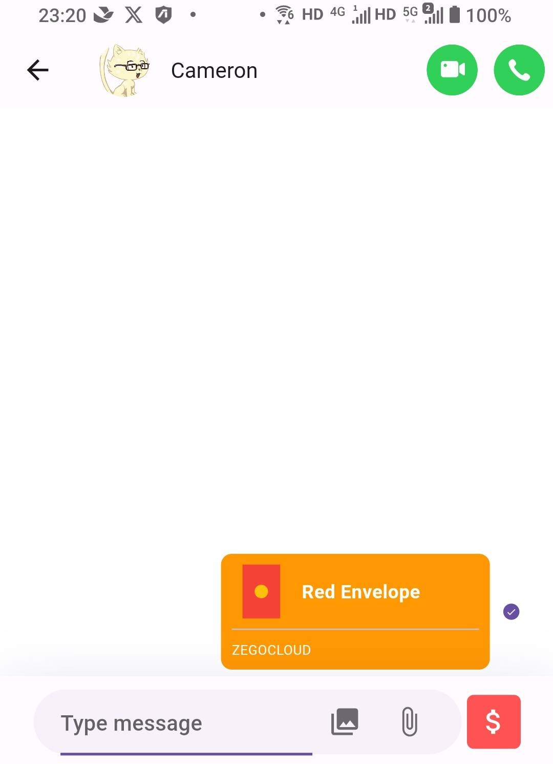)
You can use ZIMKit().sendCustomMessage() to send your custom message, which can be a red envelope, gift, vote, or any other type of message.
What you need to do is define your message protocol, encapsulating customType and customMessage. Generally, you can define customMessage as JSON format and further expand your message protocol.
ZIMKit().sendCustomMessage(
  conversationID,
  conversationType,
  customType: DemoCustomMessageType.redEnvelope.index,
  customMessage: jsonEncode({'count': 10, 'money': 100}),
);The UI of each message can be customized, You can use the messageItemBuilder or messageContentBuilder to build your custom message widget.
messageContentBuilder:
In most cases, you may only need to customize the message body, while keeping the avatar or the send status icon next to the message. to do so, you can use the messageContentBuilder. The parameter types are as follows:
final Widget Function(BuildContext context, ZIMKitMessage message, Widget defaultWidget)? messageContentBuilder;You can use it like this.
ZIMKitMessageListPage(
  conversationID: conversation.id,
  conversationType: conversation.type,

  messageContentBuilder: (context, message, defaultWidget) {
    if (message.type == ZIMMessageType.custom &&
        message.customContent!.type == DemoCustomMessageType.redEnvelope.index) {
      return RedEnvelopeMessage(message: message);
    } else {
      return defaultWidget;
    }
  },
);
messageItemBuilder:
ZIMKitMessageListView is essentially a listView. If you need to customize the drawing of the avatar, message body, sender's name, and sending status, you can use the messageItemBuilder."
The parameter types are as follows:
final Widget Function(BuildContext context, ZIMKitMessage message, Widget defaultWidget)? messageItemBuilder;In addition to fully customizing the message item, you can also change the primaryColor of the default message widget to yellow. The code is as follows:
ZIMKitMessageListPage(
  conversationID: conversation.id,
  conversationType: conversation.type,

  messageItemBuilder: (context, message, defaultWidget) {
    return Theme(
      data: ThemeData(primaryColor: Colors.yellow),
      child: defaultWidget,
    );
  },
);You can use ZIMKit().updateLocalExtendedData to update message's local extended data.
Message extended data can be used to display the business logic carried by the messages.
ZIMKit().updateLocalExtendedData(message, 'localExtendedData');You can use ValueListenableBuilder to listen to the value of message.localExtendedData at any place where you can access the zimkit message, or you can directly read the current value using message.localExtendedData.value.
ZIMKitMessageListPage(
  conversationID: conversation.id,
  conversationType: conversation.type,

  messageItemBuilder: (context, message, defaultWidget) {
    // ....
    final extendedDataWidget = ValueListenableBuilder(
      valueListenable: message.localExtendedData,
      builder: (BuildContext context, String localExtendedData, Widget? child) {
        return Text(localExtendedData);
      },
    ),
    // ...

    return ...;
  },
);